Problem
Our personal links usually look like this when we store them:
https://www.behance.net/?tracking_source=typeahead_search_direct&search=data%20viz
-It makes them dicult to identify at rst glace, so we waste time
-Our preferences and personalized libraries usually come from a curation of dierent sites: we have a pinterest board, a dribble collection, etc. so the collections scattered on dierent sites make it inconvenient to navigate, having to open multiple sites.
Existing platforms like “Pocket”
-Difficult to share with others
-Doesn’t allow for visualizing our data. Tracking and categorizing how our attention is being spent,
relevant themes ight allow for better control of our time or interests.
Ex: “I see i have a lot of resources pertaining to entertainment, pehaps I need to cut back”
-It’s geared more towards saving personal content than to organize your workspace. The interface takes up more space because it includes a thumbnail image.
Objective
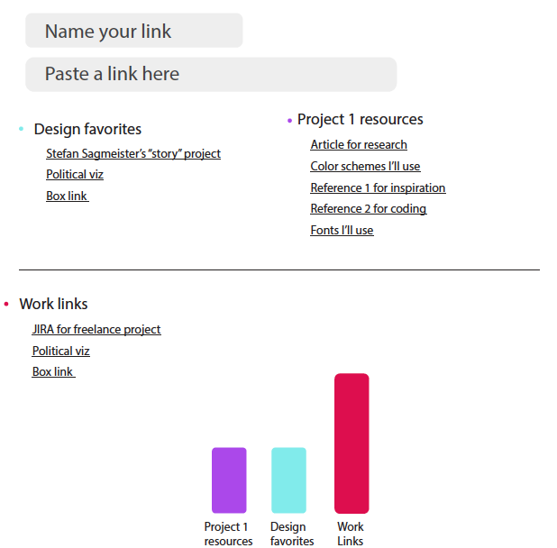
Create a page that transforms long links into renamed hyperlinks, that can be easily remembered and organized into categories to simplify navigation and save time in the workspace while visualizing the categories to see where resources and time are being spent.
Design Process
First sketches:

Second phase before coding:
I realized the colors could have been simpler than the first draft, the alignment of the elements needed to be perfected and

Link to the repository:
https://github.com/ernestofurchtgott/Interactive-Data-Vis-Sp2021/tree/main/proj1

